
Monday, September 29, 2008
The Commune
The commune exists silently in the shadow of the rising titans. This particular instance of the commune, for there are many around Beijing that look almost exactly like it, is situated footsteps away from both the tallest and most massive additions to Beijing’s emerging skyline. The adjacency of the two urban systems represents the antagonism between China’s one party, two ideology system: communism’s provision of welfare and housing, and capitalism’s neo-liberalism’s free market, laissez-faire form of urbanization.
The commune is under siege. Dislocation, dismemberment, and extradition are but a few of the possible dangers that confront the commune. The crystallization process overtaking large portions of the CBD threatens to transform the commune into steel and glass monoliths. Urbanization without qualities; this is the horrifying potential future of the commune.
The commune faces its destroyer on a daily basis. The commune acts and feels like an enclave, a safe haven separated from the rest of the CBD. A quick glance up is all it takes to remind you of the threat of displacement and the erasure of the space of your life memories.
The commune is the black sheep of the family. The story of preservation in Beijing is similar to those in the rest of the world: buildings considered of extreme cultural and/or historical significance are given the exalted status of preserved by the government. These are the temples, palaces, and important Communist-era buildings in Beijing. Grassroots organizations and citizen activists have fought long and hard for the recognition of the hutong communities. There have been some minor acknowledgements on the part of the government with small areas achieving conservation status. The commune, as far as I know, is notoriously absent from these discussions.
The commune is a framework. The architecture of the commune is quiet, sits in the background, and creates a poetic frame for the quotidian activities of the daily lives of its inhabitants. The buildings are relentlessly parallel and repetitive. This develops into an obscurity which transforms the open space into the urban protagonist. The open spaces are differentiated through various programming, intensities of vegetation, and the inclusion of smaller structures that act as storage, retail, or office space.
The commune is malleable. It is a simple, flexible system—its spaces adaptable and easily regenerated. The architecture is simple and easily renovated. It is not so tightly woven that the introduction of new infrastructure is impossible or even destructive. When thinking about preservation there is always the question of what to preserve and how much to preserve—should these places be frozen in time? In the case of the commune total preservation would be a death sentence—its structure should be preserved but the physical objects can be allowed to change, upgrade, renovate, and regenerate as needed.
The commune is familiar. The scale of the buildings, the spaces in between, and the road networks are fine-grained and most importantly, comfortable. The commune is filled with people playing, people eating, people commuting, but it is not crowded. There is a feeling of community and of shared values among the people here. It feels like home.
The commune's geotagged location.
Friday, September 26, 2008
Shlian's Geo-inspiration
A few days ago while doing more research on geo-mimicry I came across the work of artist paper engineer Matt Shlian via the weblog Lynn Was Here. It was originally this image that caught my eye:
 Desert, by Matt Shlian
In this work I see the juxtaposition of two different topographic systems which create a kind of surfacial moiré. The first is the topography of the image, implied through the relative values of light and shadow printed on the page, the second is the physical topography of the page resulting from Shlian’s technique of origami. The overlap of these two systems create a more complex reading of geometry and surface than each would have individually, and is something that I think could be an interesting technique for advancing the ideas and mechanisms of geo-mimicry in design—the development of techniques for transforming the found geological condition but leaving its trace embedded in the artifact.
But as I tried to find this image on Shlian’s personal website I came across many other amazing images. The ones that follow all seem part of a similar investigation in geometric tessellations and topography. They remind me of the geometric explorations of Baroque polymaths-such as Guarini and Borromini-that lead to advances in architecture, sculpture, engineering, and yes, urbanism. It is this ability for such drawings to cross disciplinary boundaries that I find them so evocative—they could be the genesis for new buildings, new landscapes, and new cities. Their ambiguous nature is evident in Shlian’s names for the drawings as well—Implosion, Crazy City, Invisible Cities, Kasparov’s Nightmare, In Between, etc.
Shlian himself writes about the relationship between his work and an emergent urbanism. Much like a self-organized city, his work is focused on process rather than product. Here he discusses how he employs algorithmic procedures with unknown results:
My drawings begin by asking indirect questions which yield no concrete answers. As with my three dimensional work, my focus is on the process rather than final product. I am fascinated with computer technology and its ability to mistranslate information. Like a game of “telephone”, multiple software programs fracture and compound text and image as they travel through different formats on the computer. Bearing little resemblance to their origin, the new information is rendered on a pen plotter creating a chaotic world rooted in happenstance. No longer legible, I see the drawings as blueprints for invisible cities, answers to questions that may unfold over time.
All images below by Matt Shlian via his website.
 In Between represents another potential technique for geographic urbanism--the creation of a middle ground that creates new relationship between the "natural" and "artificial".
 Kasparov's Nightmare
 Everything, Everything
 Morning Glory Lane
 Exploded Spheres
 Murq
Murq
 Seeing is Forgetting
 Desert, by Matt Shlian
But as I tried to find this image on Shlian’s personal website I came across many other amazing images. The ones that follow all seem part of a similar investigation in geometric tessellations and topography. They remind me of the geometric explorations of Baroque polymaths-such as Guarini and Borromini-that lead to advances in architecture, sculpture, engineering, and yes, urbanism. It is this ability for such drawings to cross disciplinary boundaries that I find them so evocative—they could be the genesis for new buildings, new landscapes, and new cities. Their ambiguous nature is evident in Shlian’s names for the drawings as well—Implosion, Crazy City, Invisible Cities, Kasparov’s Nightmare, In Between, etc.
Shlian himself writes about the relationship between his work and an emergent urbanism. Much like a self-organized city, his work is focused on process rather than product. Here he discusses how he employs algorithmic procedures with unknown results:
My drawings begin by asking indirect questions which yield no concrete answers. As with my three dimensional work, my focus is on the process rather than final product. I am fascinated with computer technology and its ability to mistranslate information. Like a game of “telephone”, multiple software programs fracture and compound text and image as they travel through different formats on the computer. Bearing little resemblance to their origin, the new information is rendered on a pen plotter creating a chaotic world rooted in happenstance. No longer legible, I see the drawings as blueprints for invisible cities, answers to questions that may unfold over time.
All images below by Matt Shlian via his website.
 In Between represents another potential technique for geographic urbanism--the creation of a middle ground that creates new relationship between the "natural" and "artificial".
 Kasparov's Nightmare
 Everything, Everything
 Morning Glory Lane
 Exploded Spheres
 Murq
Murq Seeing is Forgetting
Thursday, September 25, 2008
Super China
Mckinsey Global Institute (MGI) issued a report in March of this year on the growth of China’s cities by the year 2025. The figures are pretty astounding. Here are the figures straight from the report:
350 million
Will be added to China’s urban population by 2025—more than the population of today’s United States
1 billion
People will live in China’s cities by 2030
221
Chinese cities will have one million + people living in them—Europe has 35 today
5 billion
Square meters of road will be paved
170
Transit systems could be built
40 billion
Square meters of floor space will be built—in five million buildings
50,000
Of these buildings could be skyscrapers, the equivalent of building up to ten New York Cities
5 times
--the number by which GDP will have multiplied by 2025
Simply amazing. Furthermore, MGI studied five scenarios for how this growth could take place (and they produced some pretty interesting infographics to animate the scenarios as well): the first follows current trends, then four hypotheses based on different growth models: distributed, hub-and-spoke, townships, and finally MGI’s economically preferred model: the SUPERCITY option:
MGI's analysis suggests that China should tailor policies that would shift urbanization toward a more “concentrated” shape of urbanization. This pattern of urbanization could produce 15 supercities with average populations of 25 million people or spur the further development of 11 urban “clusters” of cities, each with strong economic networks and combined populations of 60-plus million. (highlights mine)
15 Supercities at 25 million or more people!! That’s 15 cities larger than any city we currently have on the planet at this time according to the ranking by the City Mayor institute.
This is essentially one giant experiment—urbanization at this scale and this speed has never occurred anywhere at any moment in history. Will the challenge be met or will the same status quo development continue to occur? Chinese planning has not been able to keep up with the rapid pace of development in the last couple of decades. Can they now leapfrog development’s lightening speed, get ahead of the curve, and control how this growth will occur? That in and of itself is one of the biggest challenges, let alone producing quality places for people to live, work, and play.
Which beg the questions—how are we going to design and construct these cities ? What forms should they take? How do we make them environmentally benevolent? Do SUPERCITIES require SUPERSTARS? (I’m tempted to venture into BLDGBLOG style conjecture at this point, but I’m not as talented and I’d rather you use your own imaginations)
It is easy in this context to understand why China is so provocative for all types of architects and urban designers—entrepreneurs, utopian dreamers, and dystopian prophets alike—in this day and age, the challenges and opportunities are endless.
350 million
Will be added to China’s urban population by 2025—more than the population of today’s United States
1 billion
People will live in China’s cities by 2030
221
Chinese cities will have one million + people living in them—Europe has 35 today
5 billion
Square meters of road will be paved
170
Transit systems could be built
40 billion
Square meters of floor space will be built—in five million buildings
50,000
Of these buildings could be skyscrapers, the equivalent of building up to ten New York Cities
5 times
--the number by which GDP will have multiplied by 2025
Simply amazing. Furthermore, MGI studied five scenarios for how this growth could take place (and they produced some pretty interesting infographics to animate the scenarios as well): the first follows current trends, then four hypotheses based on different growth models: distributed, hub-and-spoke, townships, and finally MGI’s economically preferred model: the SUPERCITY option:
MGI's analysis suggests that China should tailor policies that would shift urbanization toward a more “concentrated” shape of urbanization. This pattern of urbanization could produce 15 supercities with average populations of 25 million people or spur the further development of 11 urban “clusters” of cities, each with strong economic networks and combined populations of 60-plus million. (highlights mine)
15 Supercities at 25 million or more people!! That’s 15 cities larger than any city we currently have on the planet at this time according to the ranking by the City Mayor institute.

This is essentially one giant experiment—urbanization at this scale and this speed has never occurred anywhere at any moment in history. Will the challenge be met or will the same status quo development continue to occur? Chinese planning has not been able to keep up with the rapid pace of development in the last couple of decades. Can they now leapfrog development’s lightening speed, get ahead of the curve, and control how this growth will occur? That in and of itself is one of the biggest challenges, let alone producing quality places for people to live, work, and play.
Which beg the questions—how are we going to design and construct these cities ? What forms should they take? How do we make them environmentally benevolent? Do SUPERCITIES require SUPERSTARS? (I’m tempted to venture into BLDGBLOG style conjecture at this point, but I’m not as talented and I’d rather you use your own imaginations)
It is easy in this context to understand why China is so provocative for all types of architects and urban designers—entrepreneurs, utopian dreamers, and dystopian prophets alike—in this day and age, the challenges and opportunities are endless.
Tuesday, September 23, 2008
Big Ups for Mitchell Joachim and Sustainable Cities
Wired magazine ran an article on Mitchell Joachim and his collective Terreform yesterday. Additionally Joachim was placed on Wired’s “2008 Smart List” as being one of 15 people the next president should ‘listen to.’ Unfortunately he was placed after people whose ideas include using big robots and bigger guns, anthropology in warfare, and embracing the Post-American age. Shouldn’t Joachim et co. optimistic vision for our future cities be a little closer to the top? Oh well. Hopefully next time.
Here are some choice quotes from the first article:
And don't get him started on sustainability. "I don't like the term," he says. "It's not evocative enough. You don't want your marriage to be sustainable. You want to be evolving, nurturing, learning." Efficiency doesn't cut it, either: "It just means less bad." Even zero emissions falls short. "This table does zero damage," he says, thumping the one in his office. "No VOCs, no carbons. Whatever. It doesn't do anything positive."
Citing US Department of Energy statistics, he says that while 29 percent of the nation's energy expenditure--what he calls "the suck"--now goes toward getting around, "in 50 years that will double." Among the biggest sources of waste, he argues, is the automobile--not only in energy but in the space it occupies (cars, he notes, spend more than 90 percent of the day parked). For nearly a century, Joachim says, "cities have been designed around cars. Why not design a car around a city?"
For some visual delight, here are some YouTube videos I dug up on Joachim and Terreform:
Today's UD News Roundup
Today is an eventful day for urban design news...
 Westside Boulevard proposals by Hargreaves/Ten Arquitectos (left) and Work AC (right)
1) New York unveils five design proposals for the new Westside Boulevard--a heavily landscaped thoroughfare that will anchor the West Side Redevelopment (and here too). I have to say that all of them seem like a distraction from the heavy handed corporate development of Related's 'megadevelopment' (curb's word, not mine), alluded to by some of the proposals as the ominous shadowy thing in the background (particularly in Gustafson/Allied Works' proposal which is reminiscent of a Hugh Ferris rendering). From the New York Post:
I don't really understand the big deal--what's wrong with connecting America's biggest playground for children (Walt Disney Land) with America's biggest playground for adults (Vegas) with a train that floats? What's not sensible about that? What, you want to connect "people" and "places" that actually "matter" by so-called "sensible" high speed train systems? sheesh!
3) And, finally, we have an emerging example of OrwellURBanism:


 Westside Boulevard proposals by Hargreaves/Ten Arquitectos (left) and Work AC (right)
2) Metropolis magazine questions the relative merits of a maglev train proposed to connect Anaheim, CA, with Las Vegas NV, compared with other, more sensible solutions:From fanciful images of hills, trails and plantings to a park filled with enormous evergreen trees and rock outcrops, the proposals from five teams of architects vying to design the park and boulevard will go before the public beginning today.
The project, part of the Hudson Yards redevelopment, will create four acres of park space down the middle of a boulevard stretching from 33rd to 42nd Streets, between 10th and 11th Avenues, and linking up with a massive new office and residential project planned for the West Side rail yard just to the south of the new avenue.
Magnetic levitation, which involves running high-speed trains on a cushion of electromagnetic attraction or repulsion (depending on the system), is one of those futuristic ideas that have never quite arrived...While we have been dreaming about floating trains, Europe has been methodically threading its cities together with a sophisticated high-speed rail network.
I don't really understand the big deal--what's wrong with connecting America's biggest playground for children (Walt Disney Land) with America's biggest playground for adults (Vegas) with a train that floats? What's not sensible about that? What, you want to connect "people" and "places" that actually "matter" by so-called "sensible" high speed train systems? sheesh!
3) And, finally, we have an emerging example of OrwellURBanism:
images via World Architecture News
World Architecture News features an interesting short editorial on a new capital city being built in Burma, despite its recent natural disaster, which killed tens of thousands of people, and the ensuing food riots. Here are some excerpts from the original article:New ‘Orwellian’ capital built on foundations of famine and poverty
Burma is building a new capital. While millions of its inhabitants are still reeling from the after effects of Cyclone Nargis and the ensuing massive rise in food prices, the military government, led by dictator Than Shwe, is building a vast new city. But all is not as it seems.
A new ‘Soviet Style’ city hall will dominate the centre of the new capital which is closed to westerners. The opulent city, founded only in late 2005, will be home mainly to government officials. There are no international flights and foreigners are banned. For good reason: The estimated build cost of £2.7 billion has been funded by trade in ruby, teak and opium and offers its residents untold luxuries (relative) including 24 hour power (unheard of in Burma), exclusive villas, three golf courses and a zoo.As you approach Naypyidaw, loosely translated as ‘abode of kings’, dusty trails turn into vast, 12 lane highways, all deserted bar the odd horse drawn trailer or a speeding convoy of blacked-out limos heading for the rumoured network of luxury houses built for Than Shwe and his junta of top generals. Reportedly locked in a closely guarded secret quarter, the exclusive villas form an essential part their opulent lifestyle including golf, gambling and much more.
Some 1,500 new blocks of apartments sprawl across the city, and in true Orwellian style, these are colour-coded depending on which government department the residents work for. Blue for health, green for agriculture and irrigation etc.
Some are clearly more equal than others.
It's like Pompidou style color coding at the scale of the city, although with some pretty sinister social-engineering undertones.
Sunday, September 21, 2008
Insanely Beautiful
Sometimes you see architecture works of such exquisite beauty that it makes you want to [insert one of the following]:
 El Croquis issues 139 and 140
This past week I have experienced these emotive outpourings and quasi-religious experiences on a near nightly basis as I have explored the two latest El Croquis. They are on the recent works of SANAA and Alvaro Siza, respectively, architects whom I have long admired (in the former individual works from Sejima, Nishizawa, and the SANAA collective are all represented). Thanks to the architecture book black market here in China
It is interesting to me that El Croquis would publish monographs on these three masters (and I do not use that term lightly) contiguously because somehow I have always put them in a similar class of architect, and not only because of their well-known affinities for monochromatic palettes. Although I must admit their ‘toute-en-blanche’ approach to swatch picking does make it rather easy to lump together. Rather it is because I feel their architecture all seem bourn from a particular place and culture, a particular time, and particular world views, thus leading to highly personal and idiosyncratic working methods and production; at the same time they are capable of transcending these particularities to achieve work that resonate universal ideas, moods, atmospheres, and a sense of timelessness. Not an easy task.
What I see in their work is something akin to a personal style except that I would rather term it a personal grammar. For, to me at least, their work has not devolved into the repetitive, monotonous, and in worse cases banal modes of production of other designers who are known for their ‘signatures.’ The idea of a personal grammar to me would connote a different strategy than a personal style. A personal grammar, developed over time, provides a designer with certain rules--guiding principals such as geometry, materials, and trajectories of exploration--but encourages invention and innovation within these rules.
- cry
- give up this whole design thing in desperation
- stop blogging, grab a sketch pad, a chunk of soft lead, some museum board, glue, and an Exacto knife and commence the creation of your next masterpiece
- all of the above
 El Croquis issues 139 and 140
It is interesting to me that El Croquis would publish monographs on these three masters (and I do not use that term lightly) contiguously because somehow I have always put them in a similar class of architect, and not only because of their well-known affinities for monochromatic palettes. Although I must admit their ‘toute-en-blanche’ approach to swatch picking does make it rather easy to lump together. Rather it is because I feel their architecture all seem bourn from a particular place and culture, a particular time, and particular world views, thus leading to highly personal and idiosyncratic working methods and production; at the same time they are capable of transcending these particularities to achieve work that resonate universal ideas, moods, atmospheres, and a sense of timelessness. Not an easy task.
What I see in their work is something akin to a personal style except that I would rather term it a personal grammar. For, to me at least, their work has not devolved into the repetitive, monotonous, and in worse cases banal modes of production of other designers who are known for their ‘signatures.’ The idea of a personal grammar to me would connote a different strategy than a personal style. A personal grammar, developed over time, provides a designer with certain rules--guiding principals such as geometry, materials, and trajectories of exploration--but encourages invention and innovation within these rules.

Municipal Library in Viana do
To me it is amazing that Siza can steel produce works that feel fresh and inventive after all these years, and distinctly his own at the same time. Two recent projects that I am particularly struck by are the Municipal Library in Viana do
What is most impressive about the work of Siza, Sejima, and Nishizawa is an attention to craft, detail, and above all beauty, which seem so out of place in today’s world of architecture. Each object, be it drawing, model, or building, is delicately crafted and questions the familiarity of common architectural elements and typologies.
Sejima’s plan drawings, for example, often look like diagrams at best or immature children’s drawings at worst: walls are represented by single lines, corners are misaligned, grids are distorted, and structure is notoriously absent from plans. Upon further study you begin to realize that those single lines are purposefully drawn: steel plates, frameless glass, single-sheets of plywood are substituted for the clumsiness of traditional walls; the corner misalignments are the result of perceptually driven decisions of countless models for particular spatial qualities; grids are distorted for programmatic or spatial reasons, never willful; and innovative structural solutions are engineered to minimize the disruption of her well-known spatial continuums.
In the end Sejima has the last laugh: what we thought to be crude drawings are actually accurate representations of structure, enclosure, and aperture collapsed into a single line. SANAA plays on our expectations of what things should be by constantly exploring the minimums and maximums of design.

SANAA, various projects, via El Croquis

Alvaro Siza, various projects, via El Croquis
Wednesday, September 17, 2008
UPDATE: Relic of the Ancient Future
As a follow up to the previous Relic of the Ancient Future post/photo essay I am adding some new images of the bulding to my flickr page and the already existing set.
Since last time I focused on the project's imagery this time I thought I would supplement it with some general analysis. Part of this stems from my desire to finally see the project from the sky. I tried and tried to find someone to let me into their apartment to get a bird's eye view but for some reason I kept scaring them away. So, alas, Google Earth images will have to suffice. I think you can see from the following image the general scale and complexity of the building. It's almost 3 football fields in length! I figure it's roughly half a mile long, maybe reaching the full 900' if you straighten it out a little bit.
 Previously I had compared this project to the hutong, saying that this might be seen as a contemporary version of the vernacular type scaled up for contemporary programs and more flexibility. I suggested it might be an interesting way to think about rehabilitation of the hutong. In order to demonstrate the difference in scale and nature of the hutong and this new structure see the comparison below (all of the aerials are shown at the same scale). For kicks and giggles I thought it would be interesting to also show the Forbidden City also at the same scale. The differences are immediately striking - the homogenous web of the hutong compared to the singularity of Pingod compared to the rigid, regal geometry of the Forbidden City. However, it is interesting to note they are all basically riffing on the courtyard typology. In a way I like to think of the courtyard as one of the basic DNA of Chinese architecture. This might be one of the reasons why the relatively recent explosion of towers in Chinese cities is such an anachronism. The apartments at Pingod represent another oft used typology of recent Chinese architecture--the wall building.
 Below is a preview of a few of the photos I added to the Relic of the Ancient Future set. In the set you can see how complex the structure's geometry is (also in the figure ground above). There are virtually no right angles in the entire project! Yet the building is rather crude in its construction and displays a lot of craftsmanship and handiwork. It makes me wonder how all of it was communicated from the architect and translated from drawing to building.
I'd like to think that maybe the architect put together not a drawing set but a set of general rules and guidelines. Maybe there was only a few typical details and some basic urban and geometric parameters to follow--maintain XX distance from the adjacent building, use only these three angles, never use the same geometric relationship twice in a row, for example. The rest would be left to the craftsman. The result would be completely unexpected but strangely familiar. "Emergent," you might say, using the parlance of our time, or "self-organized." Could this also be a strategy for design in undeveloped areas or in disaster relief areas?
There was a discussion on Flickr about my previous comments on the beauty of the uninhabitated building and how I was worried that it would not be as beautiful or interesting once it was inhabited. Part of it was I really enjoyed seeing how the structure was appropriated by squatters. I would love to hear what all of you out there in Cyberspace think about it!
Without further adieu, the photos:


Since last time I focused on the project's imagery this time I thought I would supplement it with some general analysis. Part of this stems from my desire to finally see the project from the sky. I tried and tried to find someone to let me into their apartment to get a bird's eye view but for some reason I kept scaring them away. So, alas, Google Earth images will have to suffice. I think you can see from the following image the general scale and complexity of the building. It's almost 3 football fields in length! I figure it's roughly half a mile long, maybe reaching the full 900' if you straighten it out a little bit.
 Previously I had compared this project to the hutong, saying that this might be seen as a contemporary version of the vernacular type scaled up for contemporary programs and more flexibility. I suggested it might be an interesting way to think about rehabilitation of the hutong. In order to demonstrate the difference in scale and nature of the hutong and this new structure see the comparison below (all of the aerials are shown at the same scale). For kicks and giggles I thought it would be interesting to also show the Forbidden City also at the same scale. The differences are immediately striking - the homogenous web of the hutong compared to the singularity of Pingod compared to the rigid, regal geometry of the Forbidden City. However, it is interesting to note they are all basically riffing on the courtyard typology. In a way I like to think of the courtyard as one of the basic DNA of Chinese architecture. This might be one of the reasons why the relatively recent explosion of towers in Chinese cities is such an anachronism. The apartments at Pingod represent another oft used typology of recent Chinese architecture--the wall building.
 Below is a preview of a few of the photos I added to the Relic of the Ancient Future set. In the set you can see how complex the structure's geometry is (also in the figure ground above). There are virtually no right angles in the entire project! Yet the building is rather crude in its construction and displays a lot of craftsmanship and handiwork. It makes me wonder how all of it was communicated from the architect and translated from drawing to building.
 I'd like to think that maybe the architect put together not a drawing set but a set of general rules and guidelines. Maybe there was only a few typical details and some basic urban and geometric parameters to follow--maintain XX distance from the adjacent building, use only these three angles, never use the same geometric relationship twice in a row, for example. The rest would be left to the craftsman. The result would be completely unexpected but strangely familiar. "Emergent," you might say, using the parlance of our time, or "self-organized." Could this also be a strategy for design in undeveloped areas or in disaster relief areas?
There was a discussion on Flickr about my previous comments on the beauty of the uninhabitated building and how I was worried that it would not be as beautiful or interesting once it was inhabited. Part of it was I really enjoyed seeing how the structure was appropriated by squatters. I would love to hear what all of you out there in Cyberspace think about it!
Without further adieu, the photos:


Tuesday, September 16, 2008
OMA @ Venice


OMA Official Press Release
OMA presents the urban renewal of two European cities at
(
La Défense Masterplan
OMA’s design for La Défense is presented in the Carlo Scarpa building, curated by Francis Rambert, alongside 12 other proposals for the region. OMA’s scheme stems from the recognition of La Défense’s struggle to maintain and expand its position on the international scene. The masterplan proposes to create a nodal point that transforms La Défense into a compact and efficient business district by creating a new central transit stop in the middle of the district with an internal shuttle that extends to the neighbouring district of Les Groues – to bring in life and also distribute to surrounding neighbourhoods.
Regeneration of Saint’Elia
OMA’s design for Saint’Elia is presented in the Italian Pavilion, in the section "Housing
The Italian Pavilion is located in the first Tesa delle Vergini at the Venice Arsenale while the French Pavilion is located in the Giardini - both will be open until November 23.
OMA’s La Defense contribution is made possible by collaboration with EPAD and the
Thursday, September 11, 2008
China Collage City
This is the first part of a series of posts demonstrating how contemporary Chinese artists are confronting issues of rapid urban transformation. This post's technique: Transformer style assemblages of buildings, urban areas, and people. These collages use the familiar images of China's new icons and personifies them. I guess the first question to pop into all of our minds is "Am I looking at Optimus Prime or Megatron?" I leave it to you decide--drop in a comment or two if you have any thoughts.
 The Outlook Magazine - September Cover
 CHI Peng - Why Should I Love You?
 Chi Peng - Dan er~
I am going to use a quote from Brian Holmes which I found in a recent issue of Urban China to preface the images. You can find the full article, which is really great, here.
There is only one possible world, only one possible dream: continuous buildings, endless highways, infinite urbanization, a city beyond the limits of the imagination. Huge urban blocks, surging arteries, expanding ring roads, metros, airports, refineries, power plants, bullet trains, a city that devours the countryside, scraping the mountains and the sky. A world city.
There is only one possible world, only one possible dream: continuous buildings, endless highways, infinite urbanization, a city beyond the limits of the imagination. Huge urban blocks, surging arteries, expanding ring roads, metros, airports, refineries, power plants, bullet trains, a city that devours the countryside, scraping the mountains and the sky. A world city.
 The Outlook Magazine - September Cover
 CHI Peng - Why Should I Love You?
 Chi Peng - Dan er~
Cao Fei aka China Tracy - RMB City
Wednesday, September 10, 2008
Pic of the... 10 September 2008
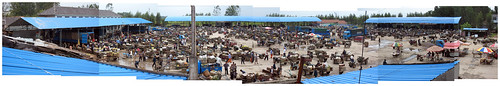
LinYi Market Panorama, originally uploaded by o d b.
LinYi Market Panorama
While traveling on the outskirts of Lin Yi in the Shandong Provinve we came across a small village where it appeared that every tractor and trailer for miles was congregating into a single alley. Venturing into that alley revealed a massive market space being prepared for the weekend trading.
I can't help but be reminded of Manuel de Landa's description of peasant and small town markets being the best example of decentralized decision-making. De Landa states
"...it is only in peasant and small town markets that decentralized decision-making leads to prices setting themselves up in a way that we can understand. In any other type of market economists simply assume that supply and demand connect to each other in a functional way, but they do not give us any specific dynamics through which this connection is effected. Moreover, unlike the idealized version of markets guided by an "invisible hand" to achieve an optimal allocation of resources, real markets are not in any sense optimal. Indeed, like most decentralized, self-organized structures, they are only viable, and since they are not hierarchical they have no goals, and grow and develop mostly by drift."
Tuesday, September 9, 2008
Edible Architecture


Top – via Vestal Design
Bottom – ‘
I arrived at work this morning, opened up my inbox, and found an invitation to consume a most delectable treat – a cake which resembled a skyscraper. The email invited us to all eat the “sweet tall tower,” a description I hope to one day overhear someone exclaim in regards to one of my future designs…”Dude, check out that sweet tall tower!”
This ‘sweet tall tower’ had all the makings of a genuine skyscraper in today’s day and age: cylindrical core, iconic wrapper, with a zone of homogenous substance sandwiched in between (in this case cake, in a typical skyscraper’s case it would be program).
The cake is made from a German company (as if you had to ask!) and the orginal name for it is Baumkuhen, literally “tree cake”. With a quick flick of my nifty delete button I can quickly turn this into Baukuhen, or “building cake,” as it should more accurately be called. German is a wonderful language like that.
A quick Google search revealed some more interesting ‘edible architecture’. The first comes from Vestal Design who created an architecture cake. (The image above is from their website). They say the “project examines the architectural symbolism and spatiality of cake.” They based their design on a great edible architecture reference. They say that “the cake designs built upon a manifesto which was published in the Yale food magazine Taste.” I have added some quotes from the original manifesto at the bottom of this post.
And in this YouTube video you can see what happens when Boy Scouts start playing dodge ball with a Buckminster Fuller inspired tetrahedron made of spaghetti and marshmallows. Those Boy Scouts probably know more about structure and joinery than most architecture students!
I am also reminded of can food stacking competitions, which is actually a great way to boil architecture down to its most essential elements: form, structure, material, color, pattern, etc.
Edifice, artifice. The time has come for cakes to rise to ever greater heights. I have seen the future of Confection, and it is Crenellated.
For centuries we have walked a fine line in both our culinary creations and our aedicular aspirations. Our collective tendency to live in our food, whether literally or figuratively, begs the eternal question: Are we eating it or is it eating us? Reformulated: why do our cakes demand to be Inhabited? Why do they so often, so irrationally, look like buildings?
To find the answer, let us scoop deep through the layers of our buried lives, our homes, and our daily bread, and our religion. Exodus tells of the departure of the Jews from Egypt, an icon of architectural achievement: for what? For the desert, the flatlands, a void unfilled by stone and brick! This unleavened wasteland was made habitable only by the culinary gift from the heavens: the manna, the holy bread of life, which replaced the first edifices of the Jews and was the badge of their freedom from the oppression of an inedible architecture.
Come now, Citizens Cake – to lead a second exodus, from the oppression of an consumptive and spaceless architecture of the present to the glories of a once and future cake!
Monday, September 8, 2008
Urban Blogging Gets Political
I found an interesting article on Planetizen this morning about urban bloggers going political, in a grassroots sense. It basically says that the ‘creative classes’ are returning from their creative excursions to creative cities and ready to tackle issues of banality back home. In
"The lack of a sustainable, planned vision for our area on the part of decades of leaders has left a developer-led landscape of mind numbing sprawl. Linear "shopping strips" and placeless big-box retail are lined up along noisy, dangerous, congested and poorly designed thoroughfares that disappear over the horizon. There are few centers, little expression of regional identity, and fewer places where communities can congregate and share ideas, or even accidentally encounter neighbors and friends (like real cities have)."
"On blogs and Web sites across our region, folks are collaborating and sharing and developing ideas on how to turn our area around — and it's just a question of time before some of these folks enter the local political scene."
Here is a link to the original article, from TampaBay.com.
Sunday, September 7, 2008
Aqua-Plagiarism
Going through BIG's delightful bag of goodies today doing some research for the Geo-Mimicry piece and lo-and-behold what to my wondering eyes did appear??!? No, silly, not 8 tiny reindeer. Not even one! But I did discover something else...an aquarURBan project that looks remarkably similar to the LILYPAD project by Vincent Callebaut discussed in the first AquaURBanism post...eerily similar, in fact. See for yourself:
 BIG - Mer
 BIG - Mer
 Callebaut - LilyPad
Geo-Mimicry 2B :: Catalogue of Projects
....And finally: the new Geo-Mimicry projects!
Rather than do a typical post I decided to create a flickr set that indexes the Geo-Mimicry movement. This set will be continually updated so check on it often. Let me know if you come across projects that should be included in the set or if you would like to have your own project included.
I am still working on a way to categorize the projects. If you have any thoughts on how to do it leave me some comments!
I hope this set of eye-candy makes up for the two previous super long-winded posts. I even won an award on an Archinect discussion for best archi-babble! Thanks guys, I'm really touched...
Previous posts:
Geo-Mimicry 2A :: Beginners / Begetters
Part 2A
To begin showing the projects of Geo-Mimicry I thought I would start by showing some of the historical precedents of geologically inspired architecture of the past. Now this could go waaaaay back in time because geology is something that has continually inspired architects through the ages. Indigenous peoples of almost every continent developed a form of architecture related to the geology of their region, as the following images from Mesa Verde, Chaco Canyon, and Tibet demonstrate.
 But the point of this post is not really to create a historical trajectory tracing geo-mimetic architecture from the annals of history to present time--for geo-mimicry is kind of like what Frank Gehry famously remarked about his use of fish for inspiration: it references something beyond the history of architecture in an attempt to create something new (it is therefore extra-disciplinary)--it is merely to demonstrate that geo-mimicry is really nothing new at all. The difference now is that it appears to have reached a central point in our disciplinary discussions, whereas in the 20th century it might said to have occupied a more peripheral role architectural discourse.
In the early 20th Century Geo-Mimicry developed a small but devout following as part of the larger Expressionist movement, particularly in Germany, Austria, and Switzerland. This sets up one of our modern trajectories of geo-mimicry, which tend to operate more geographically than chronologically. I'm going totally out on a limb here, but I would venture to guess that geology was put into the minds of architects by the growing number of expeditions and explorations of virgin geographies in the 19th Century, which were glorified and put into the popular zeitgeist by artists like Caspar David Friedrich, and his painting Das Eismeer (The Sea of Ice), from 1823 – 1824.
 In expressionist architecture, it was Bruno Taut that would make the greatest argument for geo-mimicry with his book Alpine Architecture: A Utopia, and the amazing drawings and etchings published as part of the book. Taut's alpine architecture was faceted, crystalline, and resembled the Alps. The amazing Taut appears to have come back from the grave to create a MySpace account from which he shares a few tidbits about his ideas:
 Unfortunately Taut only realized a couple of works that resemble some of the fantasies of his Utopian Alpine vision. The most famous of which is the Glass Pavilion constructed as part of the Cologne Werkbund exhibition. Again, from his MySpace page, Taut continues:
 Taut Glass Pavilion, Cologne
Skipping ahead a few years we come to Gunther Domenig, and Austrian architect who spent years working on his personal utopia--his very own house called Stein Haus. Steinhaus--Stonehouse is a book published by the AA to commemurate the home, which "tells the story of the conception and construction of a home cum studio cum intellectual haven for the architect in a landscape which has been part of his personal memory bank of images since childhood." This landscape is the remote mountain landscape of rural Austria. You can see another amazing photo of this house here on Flickr.
 Domenig, Stein Haus
Another recent example of the Austrian trajectory is Hans Hollein's project for the Vulcania museum in Auvergne, France. This project represents a low point for the geo-mimicry project, for it is an example of the simplest form of easy-to-consume Disneyfied geo-iconography--you mine as well put some fake lava and smoke plumes in there to finish it off. Although I have to admit it did result in an interesting space within the sheared conical structure--I just wish it wasn't meant to actually represent a volcano. It's a little 1:1 and closes off other interpretations. But that opens up another can of worms that I am not very well qualified to speak about.
 Hollein, Vulcania
And now we move from the European front to the New World to look at the other geographical trajectory--the American Southwest, best exemplified by Antoine Predock.
In my previous post on Geo-Mimicry I stated that Vicente Galluart might be the best example of a geological architecture. I might be eating those words today. Predock has been honing his special blend of geological architecture for some time now, and rarely strays from this path, despite an increased global production from his previously regional practice in New Mexico. This is one of the great things about geo-mimicry--since you are claiming the Earth as your primary context and source code, you can apply it anywhwere (see images below--projects from New Mexico, Minnesota, and China). Predock describes this when he says
 Predock's writings on architecture to me are probably the best example of what Geo-Mimicry in architecture could be. He discusses a lot of the topics I put forth in the previous Geo-Mimicry post. I still feel like his work is more about a formal resonance with geology, rather than what a process based approach would be, but it is still compelling. He speaks about the aspect of geological time when he writes
To close, and to bring the discussion to the present day (although Hollein and Predock are both still active, I don't think they occupy a central role in the contemporary discussion on geo-mimicry) I close with two projects that, because of their mass appeal and wide publication, made it safe to talk about rocks again in contemporary architecture. Although I'm sure this was not their intention, for neither of them are really about rocks and geology at all, they just look like rocks, and they are both often referred to as rocks. So here goes...
OMA's Casa de Musica and Aranda/Lasch's Grotto project. One paved the way for building's that are strangely contextual despite the fact that they look nothing at all like their surroundings and one made it safe for the digital exploration of rock-like forms.


To begin showing the projects of Geo-Mimicry I thought I would start by showing some of the historical precedents of geologically inspired architecture of the past. Now this could go waaaaay back in time because geology is something that has continually inspired architects through the ages. Indigenous peoples of almost every continent developed a form of architecture related to the geology of their region, as the following images from Mesa Verde, Chaco Canyon, and Tibet demonstrate.
 But the point of this post is not really to create a historical trajectory tracing geo-mimetic architecture from the annals of history to present time--for geo-mimicry is kind of like what Frank Gehry famously remarked about his use of fish for inspiration: it references something beyond the history of architecture in an attempt to create something new (it is therefore extra-disciplinary)--it is merely to demonstrate that geo-mimicry is really nothing new at all. The difference now is that it appears to have reached a central point in our disciplinary discussions, whereas in the 20th century it might said to have occupied a more peripheral role architectural discourse.
In the early 20th Century Geo-Mimicry developed a small but devout following as part of the larger Expressionist movement, particularly in Germany, Austria, and Switzerland. This sets up one of our modern trajectories of geo-mimicry, which tend to operate more geographically than chronologically. I'm going totally out on a limb here, but I would venture to guess that geology was put into the minds of architects by the growing number of expeditions and explorations of virgin geographies in the 19th Century, which were glorified and put into the popular zeitgeist by artists like Caspar David Friedrich, and his painting Das Eismeer (The Sea of Ice), from 1823 – 1824.
 In expressionist architecture, it was Bruno Taut that would make the greatest argument for geo-mimicry with his book Alpine Architecture: A Utopia, and the amazing drawings and etchings published as part of the book. Taut's alpine architecture was faceted, crystalline, and resembled the Alps. The amazing Taut appears to have come back from the grave to create a MySpace account from which he shares a few tidbits about his ideas:
My plans for an Alpine Architecture really took off—it was basically this utopian vision of a world where the natural landscape would be beautified by buildings/sculptures of illuminated colored glass, and these structures would bring people together despite class or national differences and be a means of spiritual renewal. Soon a new society could form, a non-hierarchical and integrative collective.
 Unfortunately Taut only realized a couple of works that resemble some of the fantasies of his Utopian Alpine vision. The most famous of which is the Glass Pavilion constructed as part of the Cologne Werkbund exhibition. Again, from his MySpace page, Taut continues:
All you architect scholars out there won’t chill out about my Glashaus (glass pavilion) at the Cologne Werkbund exhibition in May…but it was pretty cool…I made a kind of prismatic dome with colored glass (it even had a waterfall in it!) as a tribute to a new architecture that combines monumental function and fantasy.
 Taut Glass Pavilion, Cologne
 Domenig, Stein Haus
 Hollein, Vulcania
And now we move from the European front to the New World to look at the other geographical trajectory--the American Southwest, best exemplified by Antoine Predock.

In my previous post on Geo-Mimicry I stated that Vicente Galluart might be the best example of a geological architecture. I might be eating those words today. Predock has been honing his special blend of geological architecture for some time now, and rarely strays from this path, despite an increased global production from his previously regional practice in New Mexico. This is one of the great things about geo-mimicry--since you are claiming the Earth as your primary context and source code, you can apply it anywhwere (see images below--projects from New Mexico, Minnesota, and China). Predock describes this when he says
New Mexico has formed my experience in an all-pervasive sense. I don't think of New Mexico as a region. I think of it as a force that has entered my system, a force that is composed of many things. Here, one is aimed toward the sky and at the same time remains rooted in the earth with a geological and cultural past. The lessons I've learned here about responding to the forces of a place can be implemented anywhere. I don't have to invent a new methodology for new contexts. It is as if New Mexico has already prepared me. (emphasis mine)
 Predock's writings on architecture to me are probably the best example of what Geo-Mimicry in architecture could be. He discusses a lot of the topics I put forth in the previous Geo-Mimicry post. I still feel like his work is more about a formal resonance with geology, rather than what a process based approach would be, but it is still compelling. He speaks about the aspect of geological time when he writes
When I am working on projects with my team ...we remind ourselves that we are involved in a timeless encounter with another place, not just a little piece of land. All of the readings that have accumulated and been assimilated there, that are imagined there, that may happen there in the future — all of these collapse in time and become the raw material with which we interact. We are not merely trying to record or express a particular epoch.And he describes the 'deep structure' of geology that I wrote about when discussing highway road cuts. Road cuts are also the space of exploration of John McPhee in his series of books on North American geology. Predock relates them to architecture when he writes
Critical to the spirit in my work is the enigmatic quality of the desert. You think you've got it, you think you understand; then you turn over a rock or crawl under a larger rock and you discover other worlds, other realms within. In a highway roadcut, for example, a sectional diagram of the earth is revealed through man's intervention. At the bottom of a roadcut in the southwest is pre-cambrian granite, overlaid by limestone…The roadcut is a poetic diagram of an investigative process for the making of architecture.
To close, and to bring the discussion to the present day (although Hollein and Predock are both still active, I don't think they occupy a central role in the contemporary discussion on geo-mimicry) I close with two projects that, because of their mass appeal and wide publication, made it safe to talk about rocks again in contemporary architecture. Although I'm sure this was not their intention, for neither of them are really about rocks and geology at all, they just look like rocks, and they are both often referred to as rocks. So here goes...
OMA's Casa de Musica and Aranda/Lasch's Grotto project. One paved the way for building's that are strangely contextual despite the fact that they look nothing at all like their surroundings and one made it safe for the digital exploration of rock-like forms.
Thursday, September 4, 2008
Geo-Mimicry
Part 1 of 2
Note: This post is broken down into two parts. Today's post will be primarily a textual description of the recent use, and future potential of geology in architecture and urbanism. The next segment will feature a series of projects illustrating the discussion.
Architecture might be said to have a mimcry complex. No, I'm not referring to a psychological affliction. I'm using it the phrase the way that evolutionary biologists use it - to refer to the collective act of a group of organisms, mimics, evolving to share common perceived characteristics with another group, the models.
Or maybe it is a mimesis complex? (and by this I do mean it psychologically) Plato and Aristotle's description of mimesis as the representation of nature in search for truth by the carpenter and the artist can be spread to architecture. For as long as architecture has existed mimesis has been used as a common technique by architects for the production of architectural form.
In the beginning was automimicry - one popular theory states that the stone details in ancient Greek temples were built to resemble vernacular wooden structures. In this case architecture mimics architecture. Then mimicry slowly crept into architecture's foundations - literally - as the use of rusticated stone and quoins were used to represent the earth growing to form a building's solid base during the renaissance. Much more recently biomimcry has been a technique used by architects. On the one hand by ecologically minded designers who want to imitate natural processes to produce sustainable architecture, and on the other hand by the avant garde, particularly digital formalists like Greg Lynn, Hernan Diaz Alonso, the Ocean collective, Andrew Kudless, Tom Wiscombe, and others.
In the past few years a new approach has emerged that appears to signal a new mimetic direction in the production of architectural form. Recent projects by architects such as Snohetta, MVRDV, and Vicente Guallarte (this list is by no means exhaustive) all t(r)end to use geological formations as inspiration. While geomimicry is a term used by some to "describe processes and technologies that mimic long term geological processes," these projects tend to use geology as a purely visual metaphor. Which is why I use the hyphenated form of Geo-Mimicry - to distinguish it from the single word geomimicry. I am also careful not to call the projects "geological" in the way that I used "geographical" in the post on New Geographies. For it seems to me they have left the logic part out of the equation (one notable exception could be Vicente Guallart, the designer who appears to be most invested in developing a geological architecture). What I mean by this is that the projects seem to mimic only the aesthetics of geological formations and not the complex processes of geology and geophysics.
But still I am drawn to these projects and excited about the possible new directions it could lead designers. The main reason for this is that it just so happens that I am currently reading John McPhee's Assembling California and I have been thinking a lot about the relationship between geology and design as I read. I think it is a lost opportunity for designers not to think about geology in terms of its processes and less formally, although I have to admit that geo-aesthetics are quite amazing in their intricacy and complexity (despite my recent questioning of the use of complexity in urbanism).
Now, the one question to be answered is why the sudden rash of geological metaphors in architecture?
While I don't know for certain, I do have a hunch as to why geology has recently become such a popular formal metaphor. And I have a couple of ideas of how designers might expand the notion of geo-mimicry.
To start, here are a few reasons why I think that architects might be drawn to geology:
1. Permanence - Any reader of John McPhee will know that the notion of permanence in geology is suspect, but most of us still view mountains and terrain as perpetually static. I think some architects are still drawn to permanence as a virtue, despite (or perhaps because of) architecture's ever-increasing impermanence.
2. Context - This I think is one of the main reasons architects have been mining geology for new material. One of architecture's most common (and easiest?) ways of dealing with context is through mimicry and assimilation. With the increased amount of city building in the untouched regions of the Middle and Far East (UAE, Mongolia, Kazakhstan, etc), it is natural that architects would look to the natural environment for source material.
3. Beauty - Let's face it - rocks just look good! If you don't know what I am talking about just Google any of the following: geology, rocks, geological folding, geodes, or virtually anything else related to geology and see for yourself.
And here's a few ideas of how designers could start thinking geologically to enhance the idea of geo-mimicry:
1. Plate Tectonics - the idea of plate tectonics and all its implications are so full of material for architects it's ridiculous. Here is just one example - I have been thinking of the idea of a geological suture and how it might relate to border conditions in urban areas. In geology the suture is the place where two plates 'dock' together and usually results in the most remarkable topography and rock formations. Sometimes the suture can be as wide as 50 miles. How might the idea of a suture be applied to urban design? Can the notion of an exceptional, thickened border with amplified intensity in form and program be an antidote to gated communities and other walled-off enclaves segregating our cities?
2. Transformation - We designers love thinking about form as part of a transformational processes. Since the earth is actually in a state of perpetual motion, the process of this motion and the morphological impacts it has on geological formations are full of interesting architectural metaphors: collision and convergence, spreading centers, subduction, shearing and strike-slip faults, transform faults, convergent/divergent margins, just to name a few.
3. Temporality - McPhee often speaks of the asynchronicity of geological time and human time. Sometimes though they can synch up, often to disastrous effects. Thinking about temporal variety can be useful in urbanism for manifold reasons: when thinking about the disparate time frames of urban districts (their metabolism, if you will), the processes of urban transformation (political time vs developer time vs implementation time, etc), or just to put everything in chronometrical perspective. Also, geological time is not linear or consistent-- temporal uncomformities and simultaneities abound and the results are rarely predictable. Additionally, geology is essentially an act of reverse engineering--figuring out what happened to the world, when, and how. The more we understand about this, the more we can project what will happen in the future. I think this is another way to think about the relationship between the disciplines of geology and design.
4. Deep Structure - The recent fascination with landscape in design has lead to thinking about architecture in terms of surface and topography. In geology, "one must develop a talent for seeing through the topography' and into the rock on which the topography was carved." (McPhee) Thinking geologically forces designers to think fully three-dimensionally construct mental maps of terrane. For rocks, "their unit-to-unit relationship--their stratigraphy and other juxtapositions--pondered as a whole is structure." (McPhee)
Literary Dystopias and Green Utopias
Here’s a quickie…some recent articles/blogs/projects that have caught my eye.


LITERARY DYSTOPIAS
I’ve come across two articles on Dystopian visions of the future this morning that both refer to a bunch of dystopian literature. Since I have not read or heard of most of them I thought you might be interested also.
First, io9 features an article in their Liberal Dystopias segment called “Best Future Dystopias Where the Liberals Have Won.” The opening line describes the raison d’etre of the piece:
“The Republican Party is gathering in
via i09
Second, I’m a little slow to this one (its all the way back from January 2008, light years in blogtime), but Adam Greenfield did an interesting piece on dystopian science fiction literature of the 1970’s in his blog Speedbird. Called “Along the Dystopia Line 1: I am your Density” it mainly discusses how SF writers in that period viewed high density urbanization as a pretty disastrous outcome for the human race. I like how he exposes SF’s fears of multiculturalism and cities in general in his description. I wonder if that is still a common trope for SF writers to use.
GREEN AVENGERS and their UTOPIAS
via crosshatchling
Guerilla Gardening has become a hot topic recently, with all the new books (1 and 2) and everything. Archinect offers a great review of the first book called Turf Wars (and Wars on Turf).
And finally, artist Anna Garforth takes guerilla gardening to the next level with her guerilla graffiti gardening (see pic above). Take that you low-level seedbombers!! This is highly cultivated guerilla gardening (pardon the pun).
Subscribe to:
Posts (Atom)


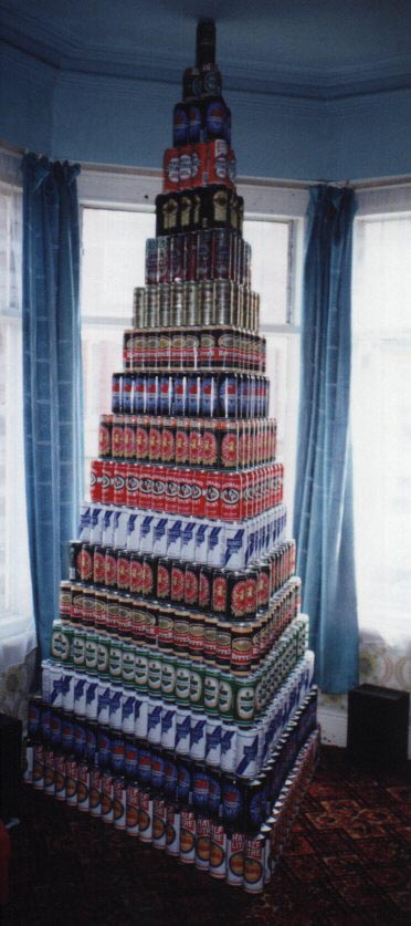