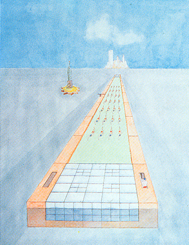
Urban farms tend to oscillate between the polar extremes of totalizing urban systems (think Broadacre City) or isolated individuals diligently planting their terraces and sills (or the lone agrarian avenger seedbombing the destitute and vacant lots of our fair cities). Work AC’s Public Farm is sitting somewhere uncomfortably in the middle.
I like to think of it as a piece of driftwood—a misplaced fragment that tells the story of an extensive dendritic network, for it is the farm’s status as a complete architectural object that bothers me the most about the farm’s realization. Work AC’s reference to Superstudio’s
 The primary element of the Public Farm contains all of the genetic code necessary to imagine the farm as a larger, more pervasive infrastructure. If so it could have avoided the ad hoc nature of the rest of the installation, which leaves a lot to be desired. The Public Farm’s repetitive module is easy to fabricate and install, and it is flexible enough to respond to singularities in topography and urban form.
Indeed, the strongest part of the design is its ability to operate across the multiple scales of furniture, architecture, and urbanism through a simple, direct formal gesture. One could imagine it as the connective tissue and iconographic symbol of a community in the way that Siza used water infrastructure in his Quinta da Malagueira social housing in
The Public Farm is an ultra-witty piece of design, full of little tricks and gadgets to remind you that urban farms can not be thought of along the same lines as our grandparents’ pastoral landscapes but must be augmented, modified, digitized. The farm becomes urbanized through technology and persistent themes of voyeurism and artificiality.
In the end one can see the Public Farm as a reference to another one of Koolhaas’ early projects: the swimming pool featured in Delirious New York. Much like the swimmers trying to cross the Atlantic, society is now looking back to our agrarian past in order to figure out how to move forward.
Postlude: It’s been a few months since I first wrote about AgroURBanism and since then the press coverage of the subject has really blown up! It is all too much for me to really keep up with, hence my lack of recent postings on it. A couple of months ago I had the chance to check out this summer’s warm up installation, Public Farm 1 by Work AC which I wrote with reference to in that earlier post. This is kind of old news but I have been meaning to write a review of it ever since. This is now a work of historiography because the installation has been dismantled. But I thought it would be good now to write some thoughts about it since I have actually seen the artifact first hand.
See Previous: AgroURBanism 1, AgroURBanism 2


No comments:
Post a Comment