Sunday, September 21, 2008

Insanely Beautiful

Sometimes you see architecture works of such exquisite beauty that it makes you want to [insert one of the following]:

  1. cry
  2. give up this whole design thing in desperation
  3. stop blogging, grab a sketch pad, a chunk of soft lead, some museum board, glue, and an Exacto knife and commence the creation of your next masterpiece
  4. all of the above

El Croquis issues 139 and 140
This past week I have experienced these emotive outpourings and quasi-religious experiences on a near nightly basis as I have explored the two latest El Croquis. They are on the recent works of SANAA and Alvaro Siza, respectively, architects whom I have long admired (in the former individual works from Sejima, Nishizawa, and the SANAA collective are all represented). Thanks to the architecture book black market here in China I was able to obtain both of these inspirational titles at an extremely moderate price.
It is interesting to me that El Croquis would publish monographs on these three masters (and I do not use that term lightly) contiguously because somehow I have always put them in a similar class of architect, and not only because of their well-known affinities for monochromatic palettes. Although I must admit their ‘toute-en-blanche’ approach to swatch picking does make it rather easy to lump together. Rather it is because I feel their architecture all seem bourn from a particular place and culture, a particular time, and particular world views, thus leading to highly personal and idiosyncratic working methods and production; at the same time they are capable of transcending these particularities to achieve work that resonate universal ideas, moods, atmospheres, and a sense of timelessness. Not an easy task.
What I see in their work is something akin to a personal style except that I would rather term it a personal grammar. For, to me at least, their work has not devolved into the repetitive, monotonous, and in worse cases banal modes of production of other designers who are known for their ‘signatures.’ The idea of a personal grammar to me would connote a different strategy than a personal style. A personal grammar, developed over time, provides a designer with certain rules--guiding principals such as geometry, materials, and trajectories of exploration--but encourages invention and innovation within these rules.

Municipal Library in Viana do Castelo, Portugal, and the Museum for the Ibere Camargo Foundation in Brazil

To me it is amazing that Siza can steel produce works that feel fresh and inventive after all these years, and distinctly his own at the same time. Two recent projects that I am particularly struck by are the Municipal Library in Viana do Castelo, Portugal, and the Museum for the Ibere Camargo Foundation in Brazil. The former is structurally daring and ambiguous, but sensitive to site and context, and provides the familiar domestic quality of Siza’s best interiors. The latter is highly sculptural and related to Siza’s biggest inspirations—Wright and Le Corbusier—without feeling deriviative due to Siza’s idiosyncratic approach to geometry and form, and again his sensitivity to site. Both of these represent a more heroic approach to structure than his earlier work, an exciting recent development of his oeuvre.

What is most impressive about the work of Siza, Sejima, and Nishizawa is an attention to craft, detail, and above all beauty, which seem so out of place in today’s world of architecture. Each object, be it drawing, model, or building, is delicately crafted and questions the familiarity of common architectural elements and typologies.

Sejima’s plan drawings, for example, often look like diagrams at best or immature children’s drawings at worst: walls are represented by single lines, corners are misaligned, grids are distorted, and structure is notoriously absent from plans. Upon further study you begin to realize that those single lines are purposefully drawn: steel plates, frameless glass, single-sheets of plywood are substituted for the clumsiness of traditional walls; the corner misalignments are the result of perceptually driven decisions of countless models for particular spatial qualities; grids are distorted for programmatic or spatial reasons, never willful; and innovative structural solutions are engineered to minimize the disruption of her well-known spatial continuums.

In the end Sejima has the last laugh: what we thought to be crude drawings are actually accurate representations of structure, enclosure, and aperture collapsed into a single line. SANAA plays on our expectations of what things should be by constantly exploring the minimums and maximums of design.

SANAA, various projects, via El Croquis

Alvaro Siza, various projects, via El Croquis

Wednesday, September 17, 2008

UPDATE: Relic of the Ancient Future

As a follow up to the previous Relic of the Ancient Future post/photo essay I am adding some new images of the bulding to my flickr page and the already existing set.

Since last time I focused on the project's imagery this time I thought I would supplement it with some general analysis. Part of this stems from my desire to finally see the project from the sky. I tried and tried to find someone to let me into their apartment to get a bird's eye view but for some reason I kept scaring them away. So, alas, Google Earth images will have to suffice. I think you can see from the following image the general scale and complexity of the building. It's almost 3 football fields in length! I figure it's roughly half a mile long, maybe reaching the full 900' if you straighten it out a little bit.

Previously I had compared this project to the hutong, saying that this might be seen as a contemporary version of the vernacular type scaled up for contemporary programs and more flexibility. I suggested it might be an interesting way to think about rehabilitation of the hutong. In order to demonstrate the difference in scale and nature of the hutong and this new structure see the comparison below (all of the aerials are shown at the same scale). For kicks and giggles I thought it would be interesting to also show the Forbidden City also at the same scale. The differences are immediately striking - the homogenous web of the hutong compared to the singularity of Pingod compared to the rigid, regal geometry of the Forbidden City. However, it is interesting to note they are all basically riffing on the courtyard typology. In a way I like to think of the courtyard as one of the basic DNA of Chinese architecture. This might be one of the reasons why the relatively recent explosion of towers in Chinese cities is such an anachronism. The apartments at Pingod represent another oft used typology of recent Chinese architecture--the wall building.
Below is a preview of a few of the photos I added to the Relic of the Ancient Future set. In the set you can see how complex the structure's geometry is (also in the figure ground above). There are virtually no right angles in the entire project! Yet the building is rather crude in its construction and displays a lot of craftsmanship and handiwork. It makes me wonder how all of it was communicated from the architect and translated from drawing to building.
I'd like to think that maybe the architect put together not a drawing set but a set of general rules and guidelines. Maybe there was only a few typical details and some basic urban and geometric parameters to follow--maintain XX distance from the adjacent building, use only these three angles, never use the same geometric relationship twice in a row, for example. The rest would be left to the craftsman. The result would be completely unexpected but strangely familiar. "Emergent," you might say, using the parlance of our time, or "self-organized." Could this also be a strategy for design in undeveloped areas or in disaster relief areas?
There was a discussion on Flickr about my previous comments on the beauty of the uninhabitated building and how I was worried that it would not be as beautiful or interesting once it was inhabited. Part of it was I really enjoyed seeing how the structure was appropriated by squatters. I would love to hear what all of you out there in Cyberspace think about it!
Without further adieu, the photos:


Tuesday, September 16, 2008

OMA @ Venice

OMA Official Press Release

OMA presents the urban renewal of two European cities at Venice Biennale


(Venice, September 15, 2008) – At the 11th International Architecture Biennale of Venice the Office for Metropolitan Architecture exhibits urban regeneration proposals for the business district of La Défense in Paris and for the neglected fishing port of Saint’Elia in Cagliari, Italy.


La Défense Masterplan

OMA’s design for La Défense is presented in the Carlo Scarpa building, curated by Francis Rambert, alongside 12 other proposals for the region. OMA’s scheme stems from the recognition of La Défense’s struggle to maintain and expand its position on the international scene. The masterplan proposes to create a nodal point that transforms La Défense into a compact and efficient business district by creating a new central transit stop in the middle of the district with an internal shuttle that extends to the neighbouring district of Les Groues – to bring in life and also distribute to surrounding neighbourhoods.


Regeneration of Saint’Elia

OMA’s design for Saint’Elia is presented in the Italian Pavilion, in the section "Housing Italy – 12 Projects for Inhabiting and Re-inhabiting the City”, curated by Francesco Garofalo. Garofalo invited a team of Italian architects to explore a series of challenges posed by the quest for quality homes in the era post subsidised housing. OMA’s design is used in a conceptual proposal produced by the Italian architecture firm Salottobuono whilst other contributors investigate proposals such as the residential conversion of industrial areas and the settlement of foreign communities immigrating to Italy.


The Italian Pavilion is located in the first Tesa delle Vergini at the Venice Arsenale while the French Pavilion is located in the Giardini - both will be open until November 23.


OMA’s La Defense contribution is made possible by collaboration with EPAD and the Amsterdam based architecture and planning firm One architecture. The Italian Pavilion is supported by AREA & the Italian Ministry for Cultural Affairs and Activities.


Thursday, September 11, 2008

China Collage City

This is the first part of a series of posts demonstrating how contemporary Chinese artists are confronting issues of rapid urban transformation. This post's technique: Transformer style assemblages of buildings, urban areas, and people. These collages use the familiar images of China's new icons and personifies them. I guess the first question to pop into all of our minds is "Am I looking at Optimus Prime or Megatron?" I leave it to you decide--drop in a comment or two if you have any thoughts.
I am going to use a quote from Brian Holmes which I found in a recent issue of Urban China to preface the images. You can find the full article, which is really great, here.
There is only one possible world, only one possible dream: continuous buildings, endless highways, infinite urbanization, a city beyond the limits of the imagination. Huge urban blocks, surging arteries, expanding ring roads, metros, airports, refineries, power plants, bullet trains, a city that devours the countryside, scraping the mountains and the sky. A world city.

The Outlook Magazine - September Cover
CHI Peng - Why Should I Love You?
Chi Peng - Dan er~

Cao Fei aka China Tracy - RMB City

Wednesday, September 10, 2008

Pic of the... 10 September 2008


LinYi Market Panorama, originally uploaded by o d b.

LinYi Market Panorama
While traveling on the outskirts of Lin Yi in the Shandong Provinve we came across a small village where it appeared that every tractor and trailer for miles was congregating into a single alley. Venturing into that alley revealed a massive market space being prepared for the weekend trading.
I can't help but be reminded of Manuel de Landa's description of peasant and small town markets being the best example of decentralized decision-making. De Landa states
"...it is only in peasant and small town markets that decentralized decision-making leads to prices setting themselves up in a way that we can understand. In any other type of market economists simply assume that supply and demand connect to each other in a functional way, but they do not give us any specific dynamics through which this connection is effected. Moreover, unlike the idealized version of markets guided by an "invisible hand" to achieve an optimal allocation of resources, real markets are not in any sense optimal. Indeed, like most decentralized, self-organized structures, they are only viable, and since they are not hierarchical they have no goals, and grow and develop mostly by drift."

Tuesday, September 9, 2008

Edible Architecture

Top – via Vestal Design

Bottom – ‘Sweet Tall Tower’

I arrived at work this morning, opened up my inbox, and found an invitation to consume a most delectable treat – a cake which resembled a skyscraper.  The email invited us to all eat the “sweet tall tower,” a description I hope to one day overhear someone exclaim in regards to one of my future designs…”Dude, check out that sweet tall tower!”

This ‘sweet tall tower’ had all the makings of a genuine skyscraper in today’s day and age: cylindrical core, iconic wrapper, with a zone of homogenous substance sandwiched in between (in this case cake, in a typical skyscraper’s case it would be program).

The cake is made from a German company (as if you had to ask!) and the orginal name for it is Baumkuhen, literally “tree cake”.  With a quick flick of my nifty delete button I can quickly turn this into Baukuhen, or “building cake,” as it should more accurately be called.  German is a wonderful language like that.

A quick Google search revealed some more interesting ‘edible architecture’.  The first comes from Vestal Design who created an architecture cake.  (The image above is from their website).  They say the “project examines the architectural symbolism and spatiality of cake.”  They based their design on a great edible architecture reference.  They say that “the cake designs built upon a manifesto which was published in the Yale food magazine Taste.”  I have added some quotes from the original manifesto at the bottom of this post.

And in this YouTube video you can see what happens when Boy Scouts start playing dodge ball with a Buckminster Fuller inspired tetrahedron made of spaghetti and marshmallows.  Those Boy Scouts probably know more about structure and joinery than most architecture students!

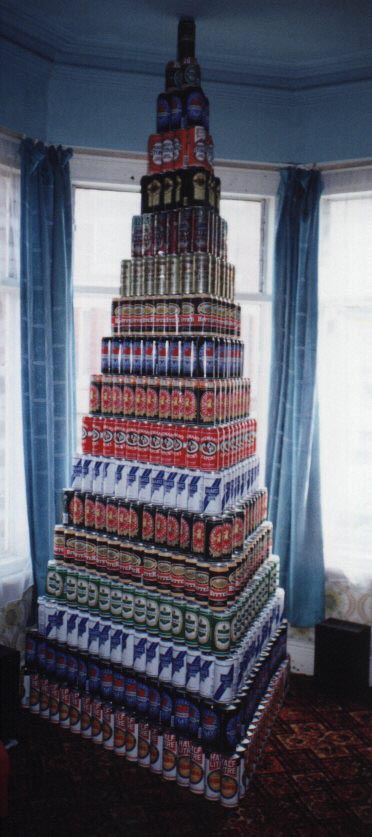
I am also reminded of can food stacking competitions, which is actually a great way to boil architecture down to its most essential elements: form, structure, material, color, pattern, etc.


Edifice, artifice. The time has come for cakes to rise to ever greater heights. I have seen the future of Confection, and it is Crenellated.

For centuries we have walked a fine line in both our culinary creations and our aedicular aspirations. Our collective tendency to live in our food, whether literally or figuratively, begs the eternal question: Are we eating it or is it eating us? Reformulated: why do our cakes demand to be Inhabited? Why do they so often, so irrationally, look like buildings?

To find the answer, let us scoop deep through the layers of our buried lives, our homes, and our daily bread, and our religion. Exodus tells of the departure of the Jews from Egypt, an icon of architectural achievement: for what? For the desert, the flatlands, a void unfilled by stone and brick! This unleavened wasteland was made habitable only by the culinary gift from the heavens: the manna, the holy bread of life, which replaced the first edifices of the Jews and was the badge of their freedom from the oppression of an inedible architecture.

Come now, Citizens Cake – to lead a second exodus, from the oppression of an consumptive and spaceless architecture of the present to the glories of a once and future cake!

Monday, September 8, 2008

Urban Blogging Gets Political

I found an interesting article on Planetizen this morning about urban bloggers going political, in a grassroots sense.  It basically says that the ‘creative classes’ are returning from their creative excursions to creative cities and ready to tackle issues of banality back home.  In Tampa I guess they are called the ‘creative diaspora’. The author predicts that these urban blog activists will become the local political heroes of tomorrow.  Here is a quote from the article:

"The lack of a sustainable, planned vision for our area on the part of decades of leaders has left a developer-led landscape of mind numbing sprawl. Linear "shopping strips" and placeless big-box retail are lined up along noisy, dangerous, congested and poorly designed thoroughfares that disappear over the horizon. There are few centers, little expression of regional identity, and fewer places where communities can congregate and share ideas, or even accidentally encounter neighbors and friends (like real cities have)."

"On blogs and Web sites across our region, folks are collaborating and sharing and developing ideas on how to turn our area around — and it's just a question of time before some of these folks enter the local political scene."

Here is a link to the original article, from TampaBay.com.